Showing posts with label D. Patterns of Dependence. Show all posts

February 25, 2012

Net Energy Deficit

By comparison with other sources of energy like coal and natural gas, the impact of petroleum on the balance of trade is huge.  Though the United States, in 2011, began exporting more "petroleum products" like gasoline, jet fuel, and distillates than it imports (for the first time in many years), it remains overwhelmingly in a net trade deficit so far as its overall energy use is concerned.

After reaching over $350 billion in 2008, the net burden of imports fell sharply in 2009 as a consequence of both the Great Recession and the fall in oil prices. Lately, however, it has been going back up. The following graph from the Energy Information Administration only includes data to the end of 2010, but the 20 percent rise in oil prices from the end of 2010 to the present (February 24, 2012) ensures that the net energy deficit has lately grown larger. Domestic oil production, though increasing, has not grown by a comparable 20 percent in the last 14 months.


According to Bloomberg—which used a misleading headline, “Americans Gaining Energy Independence with U.S. as Top Producer”—the United States has increased the percentage of demand met from domestic sources to an estimated 81 percent through the first 10 months of 2011, the highest level since 1992.

U.S. energy self-sufficiency has been steadily rising since 2005, when it hit a low of 70 percent . . . . Domestic crude oil production rose 3.6 percent last year to an average 5.7 million barrels a day, the highest since 2003, according to the Energy Department. . . . [The Bloomberg figures do not include natural gas liquids or biofuels, which boosts domestic production by another 3 mbd or so].

At the same time, the efficiency of the average U.S. passenger vehicle has helped limit demand. It increased to 29.6 miles per gallon in 2011 from 19.9 mpg in 1978, according to the National Highway Traffic Safety Administration. . . .

With the price of a barrel of oil at about $100, a drop of 4 million barrels a day in oil imports -- which . . . could happen by 2020, if not before -- would shave $145 billion off the deficit. Through the first 11 months of last year, the trade gap was $513 billion, according to the Commerce Department. Crude for March delivery settled at $96.91 a barrel yesterday [February 5, 2012] on the New York Mercantile Exchange. . . .

The U.S. likely became a net exporter of refined oil products last year for the first time since 1949. And it will probably become a net exporter of natural gas early in the next decade . . . .

Crude production in the U.S. is already increasing. Within three years, domestic output could reach 7 million barrels a day, the highest in 20 years . . . The U.S. produced 5.9 million barrels of crude oil a day in December, while consuming 18.5 million barrels of petroleum products . . . North Dakota -- the center of the so-called tight-oil transformation -- is now the fourth largest oil-producing state, behind Texas, Alaska and California. . . .

Automakers have agreed to raise the fuel economy of the vehicles they sell in the U.S. to a fleetwide average of 54.5 miles per gallon by 2025 under an agreement last year with the Obama administration. . . .

The 2008-09 recession helped lower oil demand, and consumption has lagged even as the economy has recovered, said Judith Dwarkin, director of energy research for ITG Investment Research in Calgary. Coupled with higher domestic output, “this has translated into an import requirement of some 15.4 barrels per person per year -- about on par with the mid-1990s.” . . .

The following Bloomberg chart shows the recent surplus in net exports of refined oil products:


Oil statistics can be tricky to pin down. The first chart below (reporting data from the Energy Information Administration) shows petroleum imports (including crude oil and products) at 11 million barrels a day at the end of 2011,  whereas the second chart (direct from the EIA) shows net imports of crude oil and petroleum products falling in December 2011 to 7.4 million barrels a day. The figures don't quite add up; there are around 3 mbd of exports of petroleum products, but crude oil exports are negligible.


March 5, 2011

China's Oil Dependence

The New York Times reports that China will announce in the next few weeks new five year targets for limiting the growth of energy consumption. In coming years, China is projected to import a greater proportion of its oil than the United States, and it is even now more dependent on the Persian Gulf than the United States. Of course, that's why America is in the Gulf: to protect China's oil imports.

From the Times:
Any energy policy moves by Beijing hold global implications, given that China is the world’s biggest consumer of energy and largest emitter of greenhouse gases. And even the new efficiency goals assume that China’s overall energy consumption will grow, to meet the needs of the nation’s 1.3 billion people and its rapidly expanding economy.

As a net importer of oil, China tends to view its energy needs as a matter of national security. And so, even as Beijing tries to quell any signs of the Arab world’s social unrest striking a political chord with Chinese citizens, the government is also intent on not letting similar upheaval impinge on its energy needs.

Zhang Guobao, who was China’s longtime energy czar until his retirement in January and is still a power broker on energy issues, said Friday that China must undertake an “arduous” task to protect its security. “Oil security is the most important part of achieving energy security,” Mr. Zhang told the official Xinhua news agency. “Preparations for alternative energies should be made as soon as possible.”

China has placed a big bet on renewable energy, emerging as the world’s biggest and lowest-cost manufacturer of wind turbines and solar panels. But the country remains heavily reliant on coal for its electricity. And its oil imports are surging after auto sales have surpassed the American market in each of the last two years.

China has also moved ahead of the United States as the biggest buyer of oil and natural gas from Saudi Arabia, which has so far avoided social upheaval but is on Mideast analysts’ watch lists. That oil is shipped in tankers that travel along sea lanes controlled by India and the United States, which adds to Beijing’s jitters.

Iran, hardly a bastion of stability, is another large supplier of crude oil to China. . . .

An important feature of the five-year plan is its call to double the share of natural gas in Chinese energy consumption, to 8 percent in 2015 from 4 percent last year . . .

As part of its effort to curb oil demand, the Chinese government has already been pursuing an aggressive program to develop electric cars, although these would run at least initially on a national grid that still relies heavily on coal.

China aims to limit energy consumption in 2015 to four billion metric tons of coal or its equivalent in other fuels . . .

Meeting the new target of no more than four billion metric tons of coal or its equivalent will require further improvements in efficiency if the economy expands 7 percent a year in the coming years.  
Much greater efficiency gains would be needed if the economy grows even faster, as most economists predict. The Chinese economy expanded 10.3 percent last year. . . .

Mr. Zhang and other Chinese officials have made little mention of climate change, which has ranked far behind energy security as a priority in Chinese policy making.

November 4, 2008

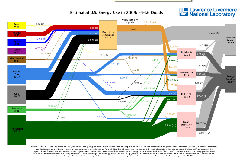
Energy Flow


After our previous excursion through the capital markets, this nice-looking chart is like entering into a vast stillness. We leave behind, as it were, the volatile emotions of the Wall Street crack den--"Nothing better! I'm gonna die!"--that characterize the American capital markets, circa 2008, and into a still meadow of settled and seemingly permament relationships.

The great currents that make up US "Energy Flow" move slowly in their accustomed paths; it's some kind of herculean effort that can shift these currents a couple of percentage points one way or the other.

The diagram also conveys the ever present balance between supply and demand, between production and consumption, each locked together in unholy matrimony.

Perhaps a form of co-dependency, with each partner reinforcing the other's bad habits? This is definitely possible.

The main point: the energy complex is all about interdependence. That fact is confronted at every turn, and not simply in those transactions that cross borders.

Here's another look at the same data as in the flow chart above, but more finely grained in showing percentage shares by resource and sector.

2 quads of energy (quadrillion btu) is equivalent to about 1 million barrels a day of oil, so the 40 quads shown in the chart for petroleum is about equal to 20 mbd of oil consumption. Of that amount, 12 mbd were imported in the 2005-2007 period.


Here's another version of U.S. energy consumption. This is from the Lawrence Livermore laboratory and shows U.S. consumption for 2009.

November 2, 2008

Diversity in World Liquids Supply


I don't especially like this chart--in fact, I dislike it--but I admire the title of the thing. Put out by the Energy Information Administration, it assures us that world liquids supply shall remain diversified in all cases. It's the hint of multiculturalism, the reaching out to constituencies not especially appreciative of big energy and in fact quite critical of it, that you gotta respect. No excruciating dependencies here. A key value--diversity--shall be preserved. In all cases. That's great.

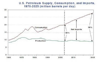
US Oil Gap to 2025


We saw a version of this before, charting the ever growing gap between US consumption and US production. The best thing about this one is not its prediction of the future but how nicely it shows the sharp fall in consumption that occurred in the 1970s.

It's difficult to escape the conclusion that we'll get something like that again. The gap between domestic production and consumption will narrow over the next few years as part of the fallout from the "vortex of debility" into which world markets have fallen. Oil consumption has already declined from a high of some 20.5 mbd to a little over 19mbd, as I recall the latest figures.

The challenge for policy? To ensure that the gap does not, when recovery comes, resume its upward march.

Here's a Simmons chart showing the effect of the larger economy on demand for oil.


Oil Production in North America to 2030


This 2007 chart from Energy Watch Group reflects the Peak Oil case. It projected less than 3 million barrels a day of domestic oil production by 2030, compared with today's consumption of 19mbd. It also forecast that tar sands would make up half of domestic North American production by 2030.

In 2011, domestic production of crude oil was 5.6 million barrels per day. "Liquids" (such as corn ethanol and natural gas liquids) make up another 3 million barrels per day. From the Energy Watch's 2007 graph, it appears that domestic production was estimated at about 5 million barrels per day in 2011. Instead of falling, however, domestic crude oil will rise another 700,000 barrels a day by 2013. Score one for the Cornucopians.

Canadian production was 2.9 mbd (including the oil sands) in 2010. Even bullish projections for tar sands do not go much beyond 5mbd by 2030. Cambridge Energy Research Associates now says 4.8 mbd in 2030.

3/15/12

November 1, 2008

Natural Gas Pipelines from Russia to Europe (2005)


This map of Russian gas pipelines to Europe is a classic, with its unmistakable likeness to maps detailing Warsaw Pact plans of military conquest during the Cold War. Going further back, there is a certain resemblance to Russia's advance into Europe to overturn Napoleon, and even of the barbarian invasions of the 5th century, when the world saw the decline and fall of just about everything.


Has Russia acted badly in its use of the "natural gas" weapon, such as it is? Perhaps in certain instances, but I don't think in the most important case. The biggest controversy arose out of Russia's brief cutoff of natural gas shipments to Ukraine a few years back. The background was a pricing dispute. Russia wanted more for its gas, the price of which had risen sharply on world markets; Ukraine wanted to keep the price of gas considerably below the world price. When the Ukrainians refused to pay, Russia refused to ship. It went something like that. It was resolved after a few days.

I don't see the basis for indignation here. The Russians did have a right to be paid a higher price. Similarly circumstanced, most nations would look to the preservation of their interests in getting that higher price.

That said, those pipelines sneaking across Europe from the great Russian gas fields are a source of serious dependence, and no doubt the Russians have on occasion behaved brusquely. Each side, of course, would suffer greatly if the gas pipelines were to have their operations interrupted, so there is a powerful interest in not pushing any advantages from such dependency. Still, the thing exists.

It's somewhat like the existence of the nuclear stalemate during the Cold War. Everyone could see that nuclear war would be madness; both sides ran the serious risk of destroying themselves if they were to launch one. But it didn't seem to follow among national security elites or even in public opinion that nuclear weapons were therefore worthless. Enough people believed that they mattered, that they mattered, if I may so express myself.

The natural gas dependency, of course, is not as bone-chilling as the prospect of nuclear immolation, but its importance to both sides makes it a conditioning factor in their relations.

Crude Oil Seaborne Trade


This map, from 1994, is a vivid representation of the course of the seaborne oil trade. To really appreciate the strategic significance, you have to imagine the US Navy patrolling and controlling the global commons on which passes this great commercial array.

While US naval power is justified in relation to "keeping the sea lanes open," the Navy's domination of the seas also gives it the capability of denying use to an adversary. It is a moral certainty that China sees this vulnerability. That has significance whatever the state of US war plans, which can change.

The chart below from BP gives the figures as of 2007 (click on the chart to get a larger version and to see the figures). As compared with the beauty above, which allows one to see at a glance the relative shares of the seaborne oil trade, the BP chart represents regression in chart making.

According to BP, the difference between China's 2007 oil production (3.73 mbd) and its oil consumption (7.86 mbd) puts net imports at 4.13 mbd. The chart on the right from the EIA shows Chinese imports a bit less than 4 mbd. The seaborne traffic is doubtless a large share of that.

The growth of Chinese imports would be nicely shown in a map like the one above, but it is lost in BP's too large "Asia-Pacific" region.

Not only can't you see the relative flows, but the BP chart is pretty tough to figure out. And there isn't a key to it that I could find. A simple table showing the breakdowns would be much clearer. Does it really help illuminate the subject to distinguish Canada, the United States, and Mexico but to throw China, India, Japan, and Austrialia into one big regional blob?

Now, let's be fair. These are pretty charts to look at. Unlike the other oil majors, BP at least bothers to convey vital information accurately to the public. Thank you for that. You get four stars for that. But dammit, man, get with the program and make better charts with the data that you have.


Petrol Consumption per Day

I stared at this chart (cropped from the Economist) long and hard and thought that I was misunderstanding things, but what it says is that the amount of petrol (or gasoline) consumed per day in the United States in 2003 was larger than that of all those other countries put together (click image to enlarge). It doesn't really square with the pie chart below.


If I've got this straight, the chart on the right is measuring gasoline consumption, whereas the pie chart is measuring oil consumption, not the same thing. But the nations listed on the right--Japan, China, Canada, Russia, Germany, Mexico, Britain, Italy, Iran, Australia, France, Brazil, Saudi Arabia, Indonesia, Venezuela, India, Spain, Taiwan, South Africa, and South Korea--would seem to take up on the pie chart a proportional size in oil consumption about double the US. Even accounting for greater US use of oil in transportation, this seems not right.

Whatever the exact figures, there is undoubtedly a vast disproportion between US consumption and the rest of the world, as this historical chart of per capita CO2 emissions shows:


The reasons for the disparity in U.S. gasoline consumption and elsewhere in the world? Perhaps the following has something to do with it.

October 31, 2008

The Growth of Dependence: US Oil Imports from 1950


This graph from the Energy Information Administration shows US production declining from a peak of 10 million barrels per day in the early 1970s to only 6 mbd by 2007. Consumption fell steeply in the 1970s as the economy fell into recession from the two oil shocks, but rose again when oil prices collapsed in 1985. Net imports are now some 12 mbd.
 
Questions: is it likely that net imports will fall further under the impact of domestic recession? Can the United States make up the gap between production and consumption by more production? What are the costs of this dependency?

October 30, 2008

Energy Return on Investment


The Energy Returned on Energy Invested (EROEI, affectionately) is a sort of master indicator of dependency, but it registers natural limits. It takes a lot more energy to produce tar sands than conventional oil. Corn ethanol, touted as a solution to the emissions problem, actually expends more energy than it produces.

For a different way of expressing the investment-return ratio, take a look at this somewhat fuzzy chart from oilreport.org, which is measuring an "Energy Profit Ratio." In the 1920s, oil yielded 100 times the energy it took to obtain and process it. According to the chart, ethanol, nuclear, wind, and tar sands do poorly today on what seems to be simply a measure of the EROEI. This is a pretty good chart, if you ask me, even if I can't read half of it.


One note of caution: the "energy/profit" ratios are changing for oil, and are biased if they give much weight to Persian Gulf oil. "New oil"--that is, oil far off shore, in the deep seabed or in various other formidable environments--requires far higher levels of energy to extract.