
After our previous excursion through the capital markets, this nice-looking chart is like entering into a vast stillness. We leave behind, as it were, the volatile emotions of the Wall Street crack den--"Nothing better! I'm gonna die!"--that characterize the American capital markets, circa 2008, and into a still meadow of settled and seemingly permament relationships.
The great currents that make up US "Energy Flow" move slowly in their accustomed paths; it's some kind of herculean effort that can shift these currents a couple of percentage points one way or the other.
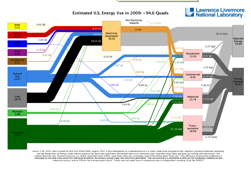
The diagram also conveys the ever present balance between supply and demand, between production and consumption, each locked together in unholy matrimony.
Perhaps a form of co-dependency, with each partner reinforcing the other's bad habits? This is definitely possible.
The main point: the energy complex is all about interdependence. That fact is confronted at every turn, and not simply in those transactions that cross borders.
Here's another look at the same data as in the flow chart above, but more finely grained in showing percentage shares by resource and sector.
2 quads of energy (quadrillion btu) is equivalent to about 1 million barrels a day of oil, so the 40 quads shown in the chart for petroleum is about equal to 20 mbd of oil consumption. Of that amount, 12 mbd were imported in the 2005-2007 period.

Here's another version of U.S. energy consumption. This is from the Lawrence Livermore laboratory and shows U.S. consumption for 2009.
No comments:
Post a Comment